Big data anlaytics pitfall Overfitting and overparameterization
In the world of big data, the Google Flu Trends (GFT) is a well know failure to point at as a testament to the weakness of big data and the pitfall those who study it can fall into. For the GFT itself, this was an attempt to predict outbreaks of flu-like illnesses through the analysis of terms being searched by individuals. While the ability to predict outbreaks with this trend model worked for a time, it began to become less consistent with the CDC data on when the outbreaks actually were. The article proposes a couple different reasons as to why these errors began to appear and why these errors show up in other big data projects. First among these reasons, is that of the perception of big data as the ultimate form of data analysis. That is, with enough data the needs of modeling, data validation, and other more traditional means of data analysis are not need. What this can result in, is a dataset that while massive and collected in seemingly a logical way does not have the hallmarks of an intentional dataset built to do analysis on. This brings us to the second reason, with a dataset built from inputs such as internet posts or other such fallible means to get a model that fits well is a challenge but possible. However, that possibility must be tempered by a full and complete understanding of the data and that different models while appearing to fit well could be concealing errors or tends to run counter to the perceived results. This, over fitting was another of the factor in the GFT issues, their 50 million search terms were fitting to only 1152 data points and while there was reasoning behind those terms that were precluded from the model some were highly correlated with the CDC’s data and likely should have been taken as a sign of overfitting. To compound this particular issue was that of the platform being used to gather this data, that being an ever changing ever evolving search engine. While such a problem is not necessarily unique to only large search engines as any data collection method may undergo updates or refinements over their lifetime, the extent to which large search engines may shift is difficult to ascertain and even more so model the impacts of. And finally, the third and final issue with the GFT and big data projects, that of reproducibility a cornerstone of science as we understand it. These big data projects with their oversized datasets and propensity towards proprietary collection methods can produce results which cannot be reproduced. This was the case with the GFT, as the researchers obscured the search terms being looked for, combined with the inability for Google to release the full dataset means this project was irreplicable and as a result with the deterioration of the predictive power of the model the GFT at this point only has real use as a warning of the pitfalls of big data.
Dr Edward Tufte The Future
The main take away from this talk I feel is that while the mission and objectives of data visualization are fairly clear, the achieving of them are far and away more difficult. A large part of this gap is that the in order to communicate data most effectively one needs to deeply understand not just the data but also how you as a researcher operate and understands yourself. According to Dr. Tufte, the problems arising from an incomplete understanding can take several forms. Perhaps the simplest presented was that of data error, inconsistent formats and incomplete datasets that go unrecognized through the analysis. On the part of the researcher, bias can arise from things like overfocusing on a particular subset or a desire to adjust the fit of the model slightly. These areas of bias can also be externally introduced, through the pressure of sponsors or even the understanding that the method being used is the “best practice”. All these can cause bias or error unless accounted for and accounted for well. Dr. Tufte’s stress this significantly, that humans are fallible, and analysis will follow especially when what is being researched are humans. However, if the one is able to reach the stage of communicating the results of the research to another person the difficulty now comes from choosing from among the myriad of methods to show, tell, or make clear which one to use and advancements in technology have only made this decision even harder. As is put forward in the presentation, data visualization has the purpose of assisting the reasoning of the viewer about what is being shown. For this reason, visualizations are always to a degree unique to the dataset and the person behind it. Even for the same data, a different person will understand it differently and wish to place the focus of the visualization on what they want to communicate from that understanding. There are however, if not better than more effective means of doing that communication, Dr. Tufte highlights elements such as contrasts, comparisons, and the use of space. There should be no extraneous elements or choices made for the sake of simplicity alone. This strikes at the central point of his talk, that excellence does not come from half measures. Communication of any form, operates at the highest level when the one doing the communicating has the knowledge of the subject and the understanding of precisely which elements of that knowledge must be comprehended by the other party. And while those elements are ambiguous and the subject unspecified, when it is used in the realm of science the understood goal should be that the truth is being sought in good faith and what is being communicated aligns as best as is able with that truth.
Comparison of Visualization Styles
Within data visualization, there are a vast range of ways to tell stories with data. And while there do tend to be best practices or optimal strategies for doing so, there is still a great deal of room for creativity and style. An example of the differences in style between schools of data visualization are those of Colin Ware and Leland Wilkinson. For Wilkinson, with the book The Grammer of Graphics he presents an introduction to how and why statistical graphics are done. As a result, while there are a great many examples of graphics and graphical elements, most of them are comparatively simple. This is a book on how to perform visualization and the graphics are built in such a way that they can easily be understood and replicated. Use of colors is limited to only when necessary and all other graphics use the other aesthetic attributes. As presented by the book, these are Form, Color, Texture, and Optics with the Form and brightness of the Color attribute being the seeming to be the most used in the book. In contrast, Ware and his book Information Visualization: Perception for Design places more focus on how the graphics is understood by the viewer and the importance of how perception works. This is a book on the why visualization is important, the parts of a graphic that are of the most use and how can one tell a story with them. What arises from this focus is the use of much more complex graphics using many more individual elements and methods than would appear in Wilkinson’s work. These graphics are for the demonstration of a theoretical topic, where the story is told in the graphic itself and not in the creation of it as would be the case in Wilkinson. Many of the graphics also use networks, connections and a degree of movement through the plots to achieve more complete and self-contained graphics. While these are better to fully communicate the information in question, they do lose a degree of understandability in that complexity while addressed in the book can still be off putting. To contrast, while Wilkinson’s work tends to come across as more understandable, he does not focus on since high-minded topics and instead works off the goal of providing a pathway in how to effectively and fully live into those topics as presented by Ware. Both books have great value in this, Ware has the why visualization is a necessary part of not just science communication but also any digital avenue of communication while Wilkinson has the how to build those visualizations in meaningful ways and the value behind each element in the toolbox of the scientist.
Wilkinson, L. 2005. The grammar of graphics (2nd ed.). Springer Science. Chicago, IL.
Ware, C. 2021. Information visualization: perception for design (Fourth edition.). Morgan Kaufmann. Cambridge, MA.
HOW TO IMPROVE YOUR RELATIONSHIP WITH YOUR FUTURE SELF
This paper focuses on the underlying parts of data analysis, namely those of coding. Bowers thesis of this paper being that all data analysis stems from programming and that programming in of itself is a means of communicating data both to those using the data but also the scientists themselves down the line. This involves both making the code clear and functional, but also future proofing the code. That is evaluating the libraries and functions being that that they will retain their functions for the full lifespan of the project and the use of comments to fully, completely, and in a proper style communicate what the code is doing and what the full flow of the project is. And while this works to keep the code clear, at the level above there is keeping the file organization clear and logical. To keep this organization, clear in the future, this should also be paired with documentation of some form. While these may seem like the obvious best practices, they do take time and effort to do well and may be forgotten or overlooked in the heat of the moment. When this occurs, it might take massively more time to correct that lack than it would have at the time when that information was still in the scientists’ mind. Regarding the data, while there are a million ways to get data into a project the number of ways that work to clearly and consistently preserve the data for both future use in the code but in a way that is accessible for other scientists to perform repetition research on the data is far more limited. It is important to note that this area falls less into the area of best practice and more into the responsibility of the researcher to do good science and provide the necessary proof of the results found, and the data used in the test is an integral part of that. Fortunately, as technology has advanced this has become easier to do, placing data into a public facing repository with proper documentation like GitHub is increasingly easy even for massive datasets. With these, it gives the additional benefits of version tracking and ease of coordination between team members. As the paper lays out, science is about communication, the best papers do not break ground in their process necessary but in how they communicate that process. That communication goes to every level of the project as well, since while the final project may be the end goal and ostensively the most important ever step along the way is communication to both of you but also a record of what the work is done, and that the conclusion drawn in the final product are both valid and meaningful. To be open, clear, and having your work checked is the basic assumption of science.
Bach, Fugue in A minor, BWV 904 Visualized
Visualizations of music are interesting in that they must give visual form to that which exists only in space a time. This particular one breaks the music down into elements which can be visualized like time, volume, notes, and instruments. Movement in this visualization is provided with the movement of time along the x axis while the notes are set along the y. Volume, instruments, and how long notes are held are show by the size and color of the elements moving along the time scale with the currently “played” notes highlighted in the center of the screen. While this works well for this piece of music, the options for this style of visualization to be used for others may not work well. The time scale for this is consistent, there is little ability to change the time signature being used as it is not represented beyond simple movement. Another problem is the musical scale being used, as it seems to be equivalent to that of a piano and as such is constrained to that scale and the half and whole step movements which it can represent. The line and circle elements may better show the movement between notes, but they too are also constrained to this scale. Finally, the lack of a legend hampers the ability of the user to deduce what elements represent, what sound and that deduction can only be done in motion. The ability of this visualization to show the music is exceptional, but it requires the attention of the viewer and not a little foreknowledge of what is being shown to be fully understood.
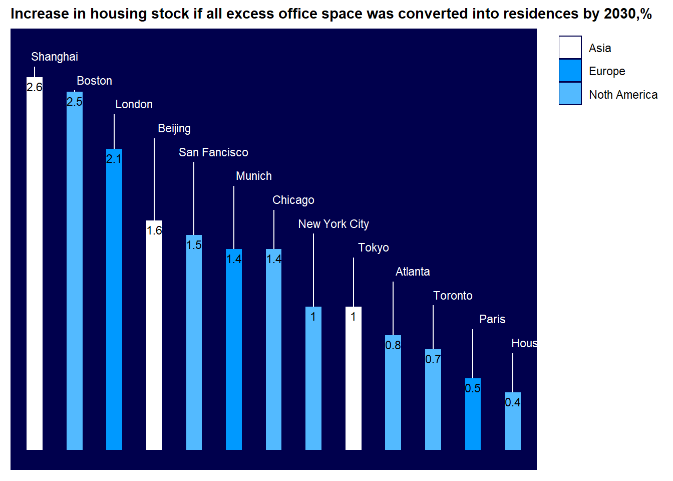
Demand for office space
While this is a fairly simple bar chart, it does quite well in demonstrating the trend in the data. Between the well spaced labels and blue color scheme the chart is very readable.
library("ggplot2")p <-ggplot(data=df,aes(x=reorder(city,ord),y=stock,fill=cont)) +geom_bar(stat="identity",width=.4) +geom_text(data=df,aes(x=city,y=tt, label = city),size=3,color="white",nudge_x=.5) +geom_errorbar(aes(ymin = stock,ymax=tt-.076),width=0,color="white") +geom_text(data=df,aes(x=city,y=stock, label = stock),vjust=1.5,size=3,color="black") +scale_fill_manual(values =c("white","#0099ff","#53baff"))+ylim(0,2.8) +ggtitle("Increase in housing stock if all excess office space was converted into residences by 2030,%")p +theme(axis.line=element_blank(),axis.text.x=element_blank(),axis.text.y=element_blank(),axis.ticks=element_blank(),axis.title.x=element_blank(), legend.title =element_blank(),axis.title.y=element_blank(),legend.position.inside=c(1,1),legend.justification =c(1,1), plot.title=element_text(size=11,face="bold"),#panel.background=element_blank(),panel.background =element_rect(fill ="#00004d"),panel.border=element_blank(),panel.grid.major=element_blank(), panel.grid.minor=element_blank(),plot.background=element_blank())