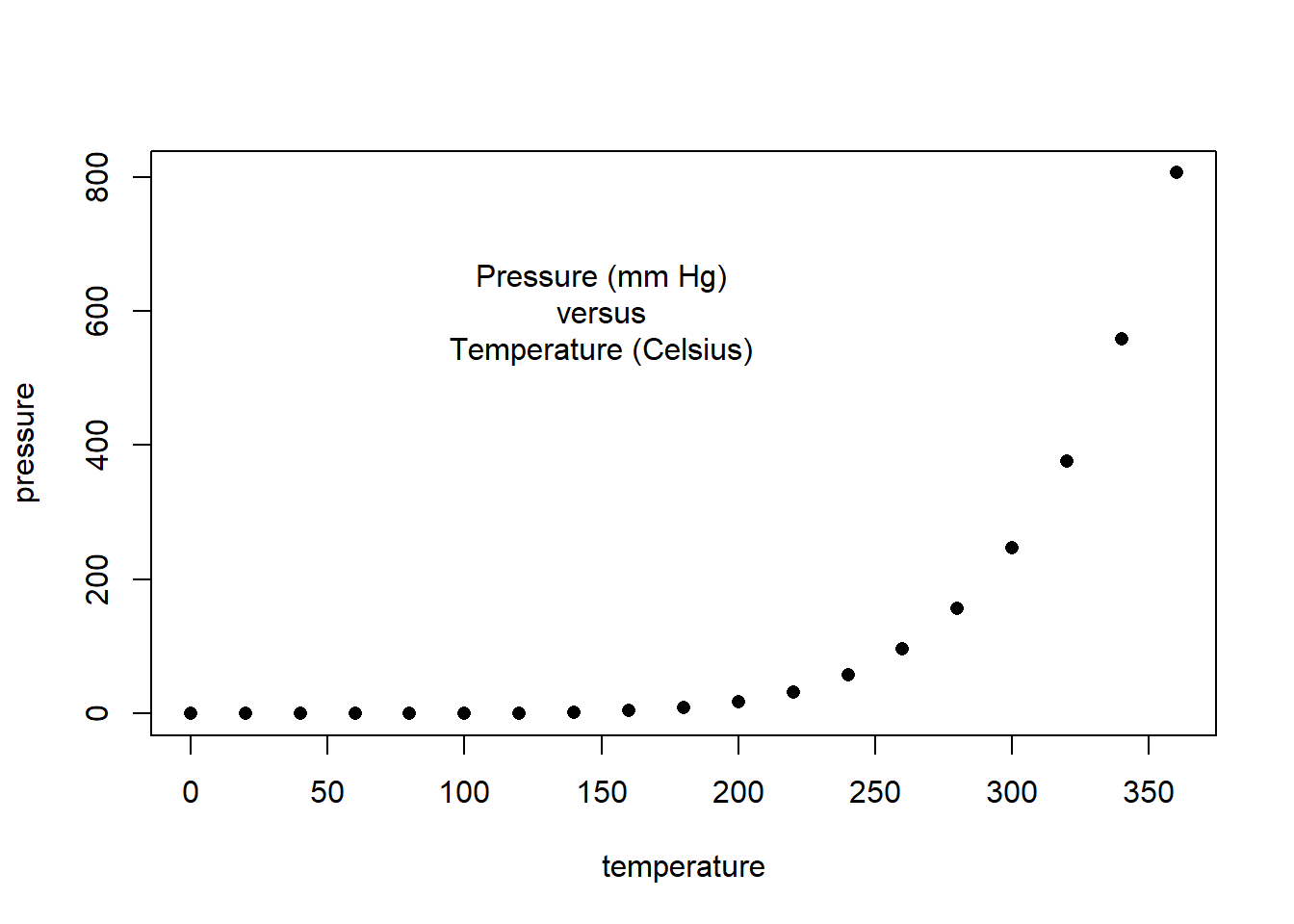
### Paul Murrell's R examples (selected)## Start plotting from basics # Note the orderplot(pressure, pch=16) # Can you change pch?text(150, 600, "Pressure (mm Hg)\nversus\nTemperature (Celsius)")
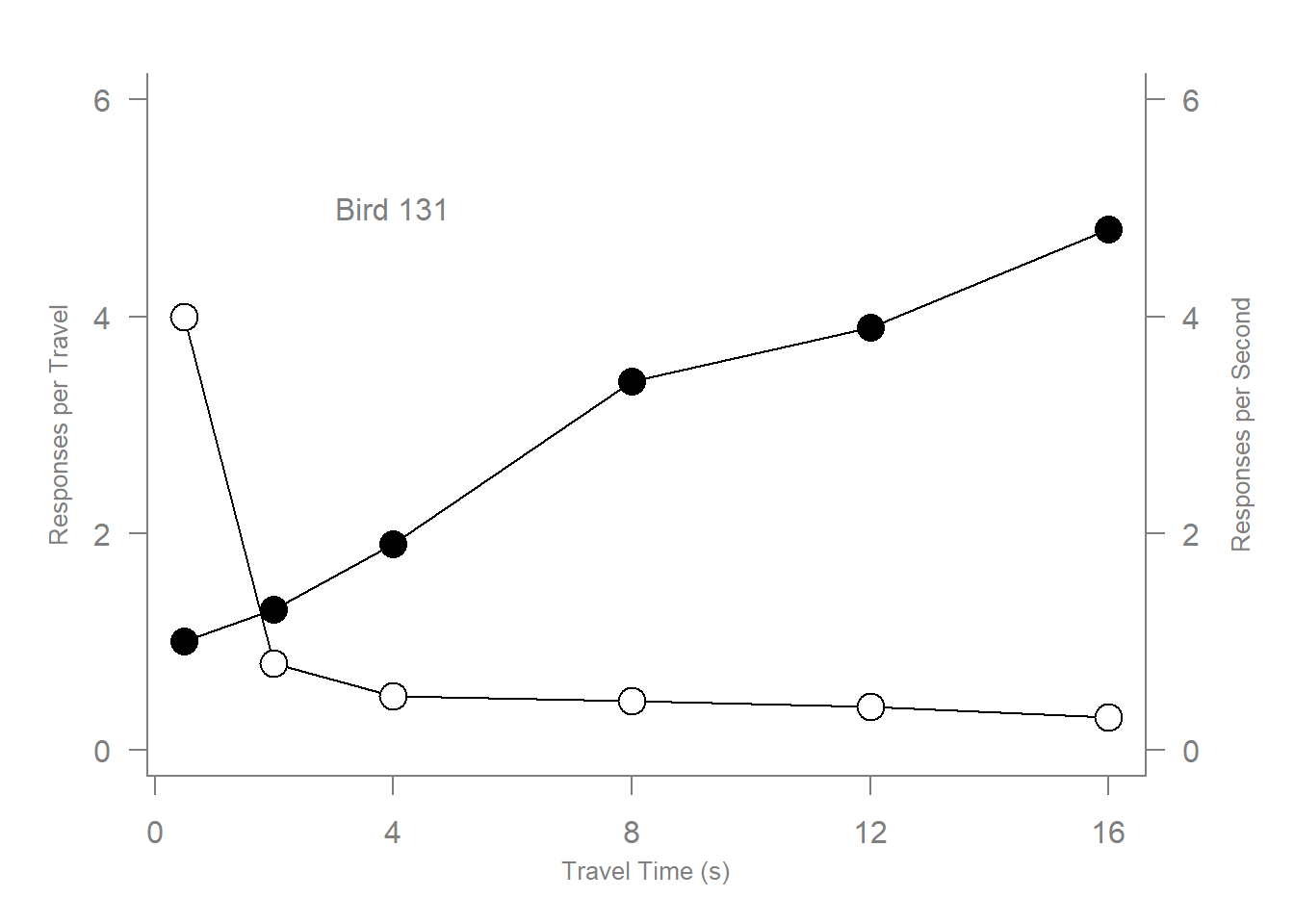
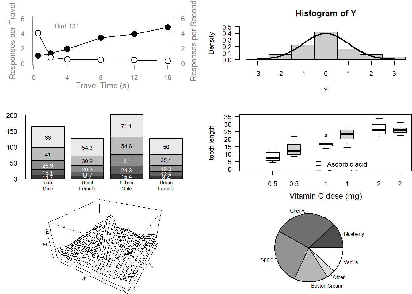
# Examples of standard high-level plots # In each case, extra output is also added using low-level # plotting functions.# # Setting the parameter (3 rows by 2 cols)par(mfrow=c(3, 2))# Scatterplot# Note the incremental additionsx <-c(0.5, 2, 4, 8, 12, 16)y1 <-c(1, 1.3, 1.9, 3.4, 3.9, 4.8)y2 <-c(4, .8, .5, .45, .4, .3)# Setting label orientation, margins c(bottom, left, top, right) & text sizepar(las=1, mar=c(4, 4, 2, 4), cex=.7) plot.new()plot.window(range(x), c(0, 6))lines(x, y1)lines(x, y2)points(x, y1, pch=16, cex=2) # Try different cex value? points(x, y2, pch=21, bg="white", cex=2) # Different background colorpar(col="gray50", fg="gray50", col.axis="gray50")axis(1, at=seq(0, 16, 4)) # What is the first number standing for?axis(2, at=seq(0, 6, 2))axis(4, at=seq(0, 6, 2))box(bty="u")mtext("Travel Time (s)", side=1, line=2, cex=0.8)mtext("Responses per Travel", side=2, line=2, las=0, cex=0.8)mtext("Responses per Second", side=4, line=2, las=0, cex=0.8)text(4, 5, "Bird 131")par(mar=c(5.1, 4.1, 4.1, 2.1), col="black", fg="black", col.axis="black")# Histogram# Random dataY <-rnorm(50)# Make sure no Y exceed [-3.5, 3.5]Y[Y <-3.5| Y >3.5] <-NA# Selection/set rangex <-seq(-3.5, 3.5, .1)dn <-dnorm(x)par(mar=c(4.5, 4.1, 3.1, 0))hist(Y, breaks=seq(-3.5, 3.5), ylim=c(0, 0.5), col="gray80", freq=FALSE)lines(x, dnorm(x), lwd=2)par(mar=c(5.1, 4.1, 4.1, 2.1))# Barplotpar(mar=c(2, 3.1, 2, 2.1)) midpts <-barplot(VADeaths, col=gray(0.1+seq(1, 9, 2)/11), names=rep("", 4))mtext(sub(" ", "\n", colnames(VADeaths)),at=midpts, side=1, line=0.5, cex=0.5)text(rep(midpts, each=5), apply(VADeaths, 2, cumsum) - VADeaths/2, VADeaths, col=rep(c("white", "black"), times=3:2), cex=0.8)par(mar=c(5.1, 4.1, 4.1, 2.1)) # Boxplotpar(mar=c(3, 4.1, 2, 0))boxplot(len ~ dose, data = ToothGrowth,boxwex =0.25, at =1:3-0.2,subset= supp =="VC", col="white",xlab="",ylab="tooth length", ylim=c(0,35))mtext("Vitamin C dose (mg)", side=1, line=2.5, cex=0.8)boxplot(len ~ dose, data = ToothGrowth, add =TRUE,boxwex =0.25, at =1:3+0.2,subset= supp =="OJ")legend(1.5, 9, c("Ascorbic acid", "Orange juice"), fill =c("white", "gray"), bty="n")par(mar=c(5.1, 4.1, 4.1, 2.1))# Perspx <-seq(-10, 10, length=30)y <- xf <-function(x,y) { r <-sqrt(x^2+y^2); 10*sin(r)/r }z <-outer(x, y, f)z[is.na(z)] <-1# 0.5 to include z axis labelpar(mar=c(0, 0.5, 0, 0), lwd=0.5)persp(x, y, z, theta =30, phi =30, expand =0.5)par(mar=c(5.1, 4.1, 4.1, 2.1), lwd=1)# Piechartpar(mar=c(0, 2, 1, 2), xpd=FALSE, cex=0.5)pie.sales <-c(0.12, 0.3, 0.26, 0.16, 0.04, 0.12)names(pie.sales) <-c("Blueberry", "Cherry","Apple", "Boston Cream", "Other", "Vanilla")pie(pie.sales, col =gray(seq(0.3,1.0,length=6)))
# Exercise: Can you generate these charts individually?  Try these functions
# using another dataset. Be sure to work on the layout and margins
Can you change pch? pch indicates the symbol to use for the points. Try different cex value?
Cex is used to change the size of an element in the plot. This is using the cex = 1.
x <-c(0.5, 2, 4, 8, 12, 16)y1 <-c(1, 1.3, 1.9, 3.4, 3.9, 4.8)y2 <-c(4, .8, .5, .45, .4, .3)# Setting label orientation, margins c(bottom, left, top, right) & text sizepar(las=1, mar=c(4, 4, 2, 4), cex=1) plot.new()plot.window(range(x), c(0, 6))lines(x, y1)lines(x, y2)points(x, y1, pch=16, cex=2) # Try different cex value? points(x, y2, pch=21, bg="white", cex=2) # Different background colorpar(col="gray50", fg="gray50", col.axis="gray50")axis(1, at=seq(0, 16, 4)) # What is the first number standing for?axis(2, at=seq(0, 6, 2))axis(4, at=seq(0, 6, 2))box(bty="u")mtext("Travel Time (s)", side=1, line=2, cex=0.8)mtext("Responses per Travel", side=2, line=2, las=0, cex=0.8)mtext("Responses per Second", side=4, line=2, las=0, cex=0.8)text(4, 5, "Bird 131")
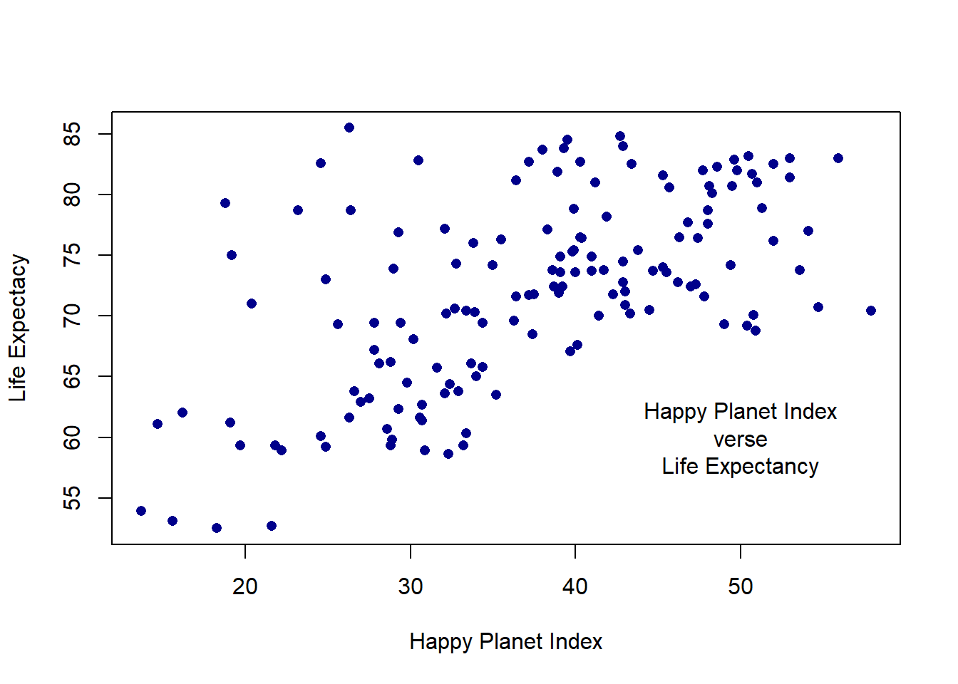
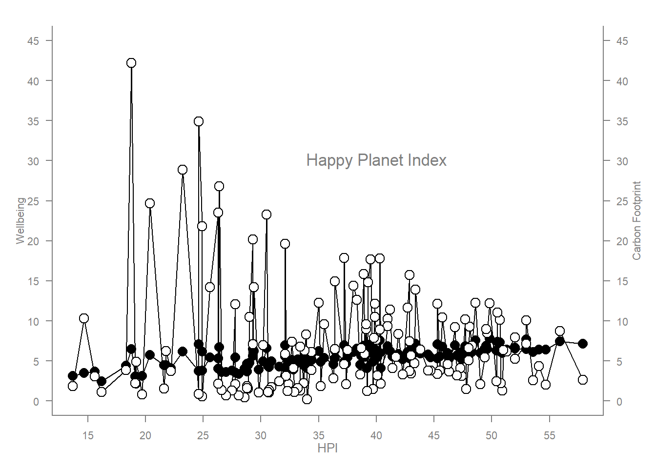
What is the first number standing for? The first number of the axis function indicates the side of the plot for the axis to be drawn on. Exercise: Can you generate these charts individually? The charts can be done individually, the par() setting the layout just needs to be removed. Try these functions using another dataset. Be sure to work on the layout and margins *Demonstration using the Happy Planet Index data.
[1] "C:/Users/brist/Documents/WebOut_Stout"
[1] "C:/Users/brist/Documents/WebOut_Stout"
This show the normal plot function and the the is a two y axis plot using the lines fucntion to connect the groups.
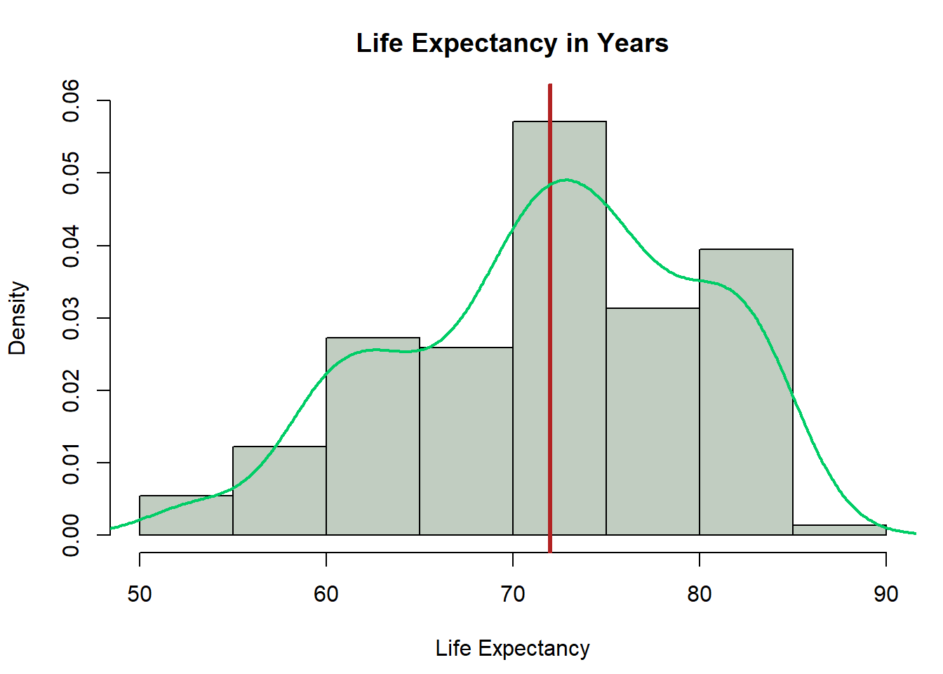
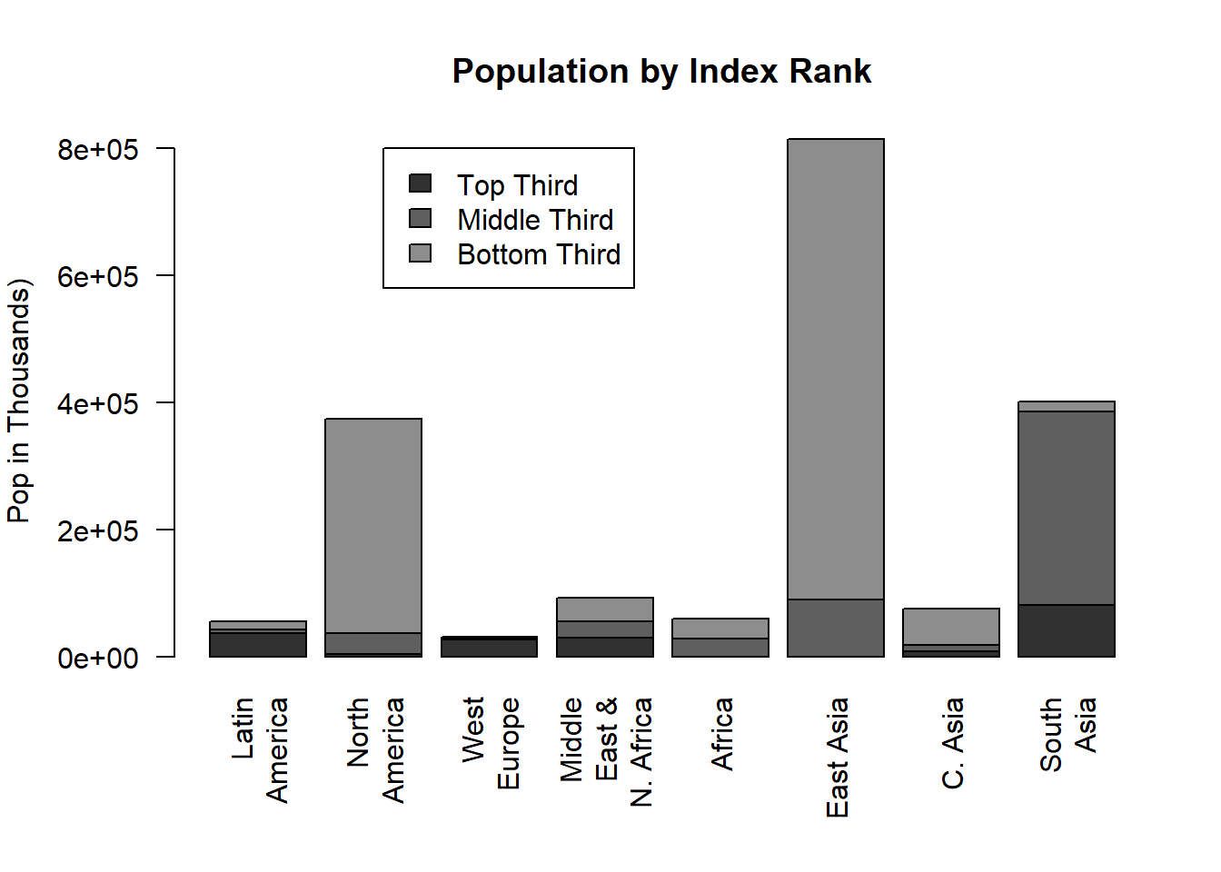
These charts are a histogram with a density curve for the life expectancy and a stack bar chart using Continent and Index rank as categorical values to show population.
lE <- hpi$Life.Expectancy..years.lE <- lE[!is.na(lE)]par(mar=c(4.5, 4.1, 3.1, 1))hist(lE, probability =TRUE, ylim=c(0, 0.06), col="honeydew3", main ="Life Expectancy in Years",xlab ="Life Expectancy")abline(v =mean(lE), col='firebrick', lwd =3)lines(density(lE), col ='springgreen3', lwd =2)
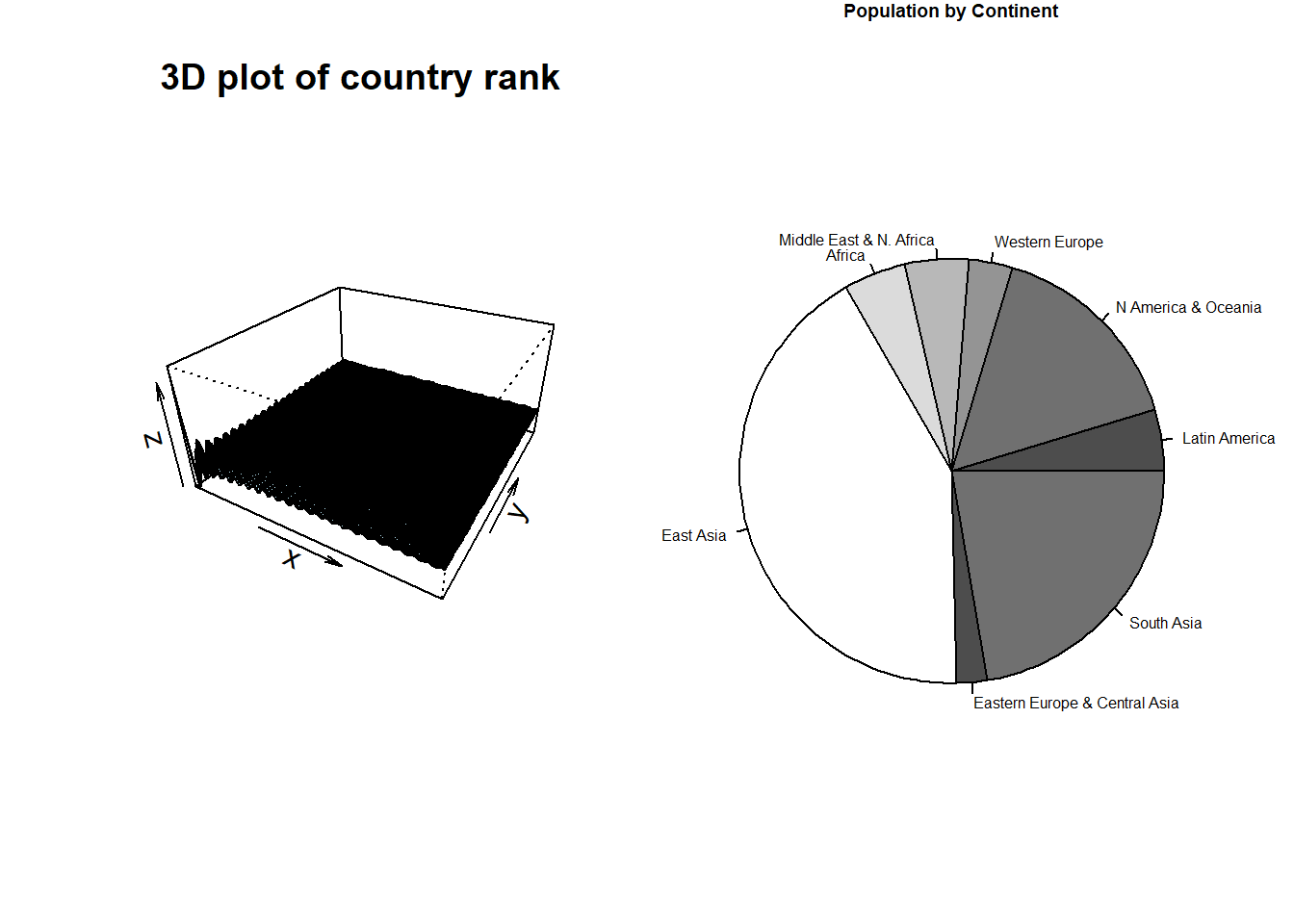
Lastly, these are a 3d chart of the country ranks and a pie chart of population by continent.
par(mfrow=c(1, 2))# Generate data for the plotx <- hpi$HPI.ranky <- xf <-function(x, y) { r <-sqrt(x^2+y^2); 10*sin(r)/r }z <-outer(x, y, f)z[is.na(z)] <-1op <-par(bg ="white")persp(x, y, z, theta =30, phi =30, expand =0.5, col ="lightblue",main ="3D plot of country rank")pop <-aggregate(hpi$Population..thousands., list(hpi$Continent), FUN="mean")par(mar=c(0, 1, 1, 3), xpd=FALSE, cex=0.5)pie(pop$x, col =gray(seq(0.3,1.0,length=6)), labels = cont,cex=1, main ="Population by Continent")
 Try different cex value?